R vs Python - Round 3
Written by Simon Garnier on February 5, 2014
Text by: Simon Garnier (www.theswarmlab.com / @sjmgarnier)
R code by: Simon Garnier (www.theswarmlab.com / @sjmgarnier)
Python code by: Randy Olson (www.randalolson.com / @randal_olson)
Document generated with RStudio, knitr, and pandoc. Python figures generated with iPython Notebook.
Foreword
My friend Randy Olson and I got into the habit to argue about the relative qualities of our favorite languages for data analysis and visualization. I am an enthusiastic R user (www.r-project.org) while Randy is a fan of Python (www.python.org). One thing we agree on however is that our discussions are meaningless unless we actually put R and Python to a series of tests to showcase their relative strengths and weaknesses. Essentially we will set a common goal (e.g., perform a particular type of data analysis or draw a particular type of graph) and create the R and Python codes to achieve this goal. And since Randy and I are all about sharing, open source and open access, we decided to make public the results of our friendly challenges so that you can help us decide between R and Python and, hopefully, also learn something along the way.
Today’s challenge: walk the line
1 - Introduction
Linear regression is one of the most popular statistical tools, in particular when it comes to detect and measure the strength of trends in time-series (but not only). Today we will show you how to perform a linear regression in R and Python, how to run basic diagnostic tests to make sure the linear regression went well, and how to nicely plot the final result.
The data we will use today are provided by Quandl. Quandl is a company that collects and organizes time-series datasets from hundred’s of public sources, and can even host your datasets for free. It is like the YouTube of time-series data. Besides having a huge collection of datasets, the nice thing about Quandl is that it provides packages for R and Python (and other languages as well) that make it very easy - one line of code! - to retrieve time-series datasets directly from your favorite data analysis tool. Yeah Quandl!
The dataset that we will explore contains information about the average contributions of individuals and corporations to the income taxes, expressed as a fraction of the Gross Domestic Produce (GDP). We will use linear regression to estimate the variation of these contributions from 1945 to 2013.
In the following, we will detail the different steps of the process and provide for each step the corresponding code (red boxes for R, green boxes for Python). You will also find the entire codes at the end of this document.
If you think there’s a better way to code this in either language, leave a pull request on our GitHub repository or leave a note with suggestions in the comments below.
2 - Step by step process
First things first, let’s set up our working environment by loading some necessary libraries.
# Load libraries
require("Quandl")         # Functions to access Quandl's database
require("lattice")        # Base graph functions
require("latticeExtra")   # Layer graph functions
import QuandlNow, let’s load the dataset from Quandl. You can find it on Quandl’s website here. Among other things, this dataset contains the contributions of individuals and corporations to the income taxes, expressed as a fraction of the GDP. Its original source is the Tax Policy Center. The dataset code at Quandl is “TPC/HIST_RECEIPT” and we will retrieve data from December 31, 1945, to December 31, 2013.
# Load data from Quandl
my.data <- Quandl("TPC/HIST_RECEIPT",
                  start_date = "1945-12-31",
                  end_date = "2013-12-31")

# Display first lines of the data frame
head(my.data)
quandl_data = Quandl.get("TPC/HIST_RECEIPT",
trim_start="1945-12-31",
trim_end="2013-12-31")
quandl_data.head()The column names from Quandl’s data frame contain spaces. We need to correct that before we can proceed with the rest of the analysis.
# The columns' names contain spaces, make them syntactically valid
names(my.data) <- make.names(names(my.data))%matplotlib inline
import matplotlib.pyplot as plt
# Rename the columns we're using with underscores -- required for the linear regression
quandl_data["Individual_Income_Taxes"] = quandl_data["Individual Income Taxes"]
quandl_data["Corporation_Income_Taxes"] = quandl_data["Corporation Income Taxes"]
quandl_data["Fiscal_Year"] = range(len(quandl_data.index))The dataset contains three columns of interest for us: individuals’ and corporations’ income taxes as a fraction of the GDP, and fiscal year. We will first plot the individuals’ and corporations’ income taxes as a function of the fiscal year to see what the data look like.
# Create graph object
graph <- xyplot(Individual.Income.Taxes ~ Fiscal.Year,
                data = my.data,
                type = c("g", "b"),
                col = "#00526D")

graph <- graph + xyplot(Corporation.Income.Taxes ~ Fiscal.Year,
                        data = my.data,
                        type = c("b"),
                        col = "#AD3333")

# Create pretty theme, because who doesn't like a nice looking graph :-)
my.theme <- within(trellis.par.get(), {
  plot.line <- within(plot.line, {
    lwd <- 3
  })

  axis.text <- within(axis.text, {
    cex <- 1.25
  })

  par.xlab.text <- within(par.xlab.text, {
    cex <- 1.5
  })

  par.ylab.text <- within(par.ylab.text, {
    cex <- 1.5
  })

  add.text <- within(add.text, {
    cex <- 1.25
  })

  superpose.line <- within(superpose.line, {
    col <- c("#00526D", "#AD3333")
    lwd <- 3
  })
})

# Compute upper and lower limits of the y axes
max.val <- max(my.data$Corporation.Income.Taxes, my.data$Individual.Income.Taxes)
ylim <- c(0 - 0.05 * max.val, max.val * 1.15)

# Prepare a legend
key <- within(list(), {
  text <- c("Individuals", "Corporations")
  corner <- c(0.05, .95)
  lines <- TRUE
  points = FALSE
})

# Update graph object
graph <- update(graph,
                xlab = "Fiscal year", ylab = "Income taxes (% of GDP)",
                ylim = ylim,
                par.settings = my.theme,
                auto.key = key)

# Print graph object
print(graph)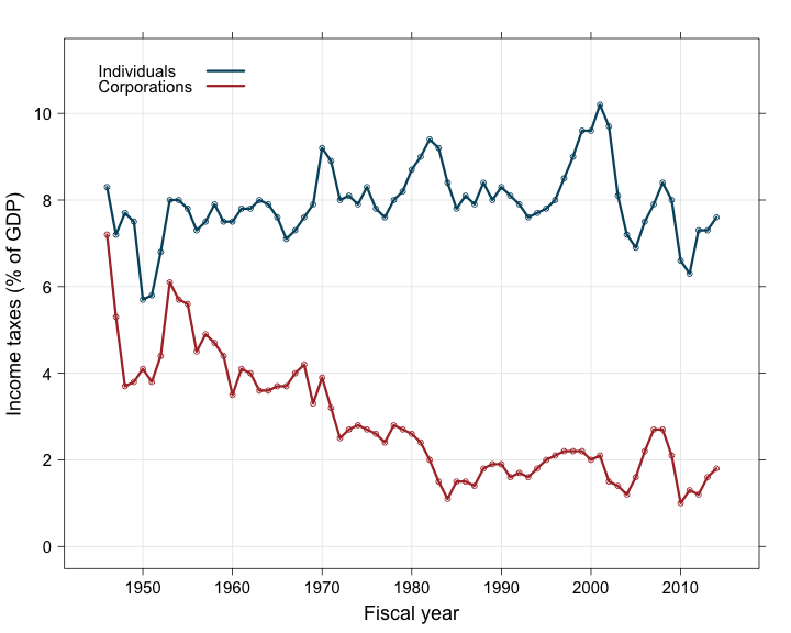
plt.figure(figsize=(12, 7))

plt.plot(quandl_data["Fiscal_Year"], quandl_data["Individual_Income_Taxes"], marker="o", color="#00526D", lw=2, label="Individuals")
plt.plot(quandl_data["Fiscal_Year"], quandl_data["Corporation_Income_Taxes"], marker="o", color="#AD3333", lw=2, label="Corporations")

plt.xlabel("Fiscal Year", fontsize=16)
plt.ylabel("Income taxes (% of GDP)", fontsize=16)

plt.xlim(-1, 69)
plt.xticks(quandl_data["Fiscal_Year"][5::10], quandl_data.index[5::10].year)

plt.grid()

plt.legend(loc="upper left");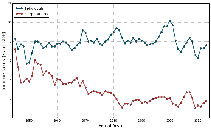
The first thing one can notice in this graph is the clear decreasing trend of the corporations’ income taxes: since 1945, they have dropped from about 7% of the GDP to less than 2\%. On the contrary, the individuals’ contribution to the income taxes seems to have remained stable around 8% of the GDP, with maybe a slight general increase over time. Also there seems to be correlated fluctuations, with several successive years of increase or decrease probably due to the prolonged action of successive governments. The intensity of these fluctuations seems uneven along the considered time period. Finally the corporations’ income taxes seem to decrease linearly (more or less) until the mid-80’s but do not seem to change much after that. These three elements (autocorrelation, heteroscedasticity and change in slope) will certainly raise flags in diagnostic tests but we will deal with them in another challenge. Today we want to focus on making and plotting simple linear regressions instead.
First, let’s fit a linear model to the individual and corporation income taxes data.
# Fit individuals' income taxes data
model.ind <- lm(Individual.Income.Taxes ~ Fiscal.Year, data = my.data)

# Fit corporations' income taxes data
model.corp <- lm(Corporation.Income.Taxes ~ Fiscal.Year, data = my.data)
# Fit a linear regression to the individual income taxes time series
individual_regression = sm.OLS.from_formula("Individual_Income_Taxes ~ Fiscal_Year", quandl_data).fit()
# Fit a linear regression to the corporation income taxes time series
corporation_regression = sm.OLS.from_formula("Corporation_Income_Taxes ~ Fiscal_Year", quandl_data).fit()Now let’s have a look to the summary statistics of each fitted model. We will display the R output only to keep things simple. However if you decide to look at the Python output, the result of the regression might look a bit different. Randy had to transform the dates into years because the fitting function did not seem capable of handling dates like the fitting function in R does (it converts the dates in days in this case).
First, the model for individuals’ income taxes:
# Summary statistics for individual income taxes model
summary(model.ind)

##
## Call:
## lm(formula = Individual.Income.Taxes ~ Fiscal.Year, data = my.data)
##
## Residuals:
##     Min      1Q  Median      3Q     Max
## -1.9522 -0.3065  0.0217  0.3101  2.0674
##
## Coefficients:
##             Estimate Std. Error t value Pr(>|t|)
## (Intercept) 7.84e+00   1.09e-01   72.18   <2e-16 ***
## Fiscal.Year 2.58e-05   1.33e-05    1.93    0.058 .
## ---
## Signif. codes:  0 '***' 0.001 '**' 0.01 '*' 0.05 '.' 0.1 ' ' 1
##
## Residual standard error: 0.806 on 67 degrees of freedom
## Multiple R-squared:  0.0528,	Adjusted R-squared:  0.0387
## F-statistic: 3.73 on 1 and 67 DF,  p-value: 0.0575
##
print individual_regression.summary()Then, the model for corporations’ income taxes:
# Summary statistics for corporation income taxes model
summary(model.corp)

##
## Call:
## lm(formula = Corporation.Income.Taxes ~ Fiscal.Year, data = my.data)
##
## Residuals:
##    Min     1Q Median     3Q    Max
## -1.535 -0.478 -0.150  0.394  2.394
##
## Coefficients:
##              Estimate Std. Error t value Pr(>|t|)
## (Intercept)  3.43e+00   9.93e-02    34.6   <2e-16 ***
## Fiscal.Year -1.56e-04   1.22e-05   -12.8   <2e-16 ***
## ---
## Signif. codes:  0 '***' 0.001 '**' 0.01 '*' 0.05 '.' 0.1 ' ' 1
##
## Residual standard error: 0.737 on 67 degrees of freedom
## Multiple R-squared:  0.711,	Adjusted R-squared:  0.706
## F-statistic:  164 on 1 and 67 DF,  p-value: <2e-16
##
print corporation_regression.summary()What do we see? For the individual income taxes, we see a small, positive increase of +2.579e-05% of GDP per day (R treats dates as days). Over the whole 1945 to 2013 period, this corresponds to a total increase of +0.64% of GDP, i.e. a +8.4% global increase in the contribution of individuals to income taxes. However this increase is only marginally significant (p = 0.0575), therefore we can consider that the contribution of individuals to the income taxes has remained fairly stable during the 7 decades since WWII.
We have a very different story for the corporation income taxes. The linear model shows a strongly significant (p < 2e-16) decrease of -1.564e-04% of GDP per day. Over the 1945-2013 period, this corresponds to a total decrease of -3.88% of GDP, i.e. a -80.1% global decrease in the contribution of corporations to income taxes.
Of course, we need to be very cautious in the interpretation of these results because the linear models we have fitted to the data do not take into account the potential sources of error that we have identified earlier. We will see next time how we can evaluate them, and correct them if necessary.
For now, we will assume that everything is good and we will focus on plotting the two linear models and their confidence interval over the data.
To do this, we will first compute the value and confidence interval as predicted by each model for different dates. We will choose dates that cover the whole studied period (1945-2013), plus a little extra on both ends (10%) to make the graph more aesthetically pleasing (i.e., the models’ predictions will cover a larger time period than the x-axis limits of the graph).
# Create new dates for model predictions
difference <- as.Date("2013-12-31") - as.Date("1945-12-31")
new.data <- data.frame(Fiscal.Year = seq.Date(from = as.Date("1945-12-31") - 0.1 * difference,
                                              to = as.Date("2013-12-31") + 0.1 * difference,
                                              by = "years"))

# Compute model predictions (values + confidence intervals) for new dates
# Model of individual income taxes
predict.ind <- within(new.data, {
  Predictions <- as.data.frame(predict(model.ind,
                                       newdata = new.data,
                                       interval = "confidence"))
})

# Model of corporation income taxes
predict.corp <- within(new.data, {
  Predictions <- as.data.frame(predict(model.corp,
                                       newdata = new.data,
                                       interval = "confidence"))
})
# Predict the 95% confidence bands for the regression
individual_prstd, individual_iv_l, individual_iv_u = wls_prediction_std(individual_regression)
individual_st, individual_data, individual_ss2 = summary_table(individual_regression, alpha=0.05)
individual_fitted_values = individual_data[:, 2]
individual_predict_mean_ci_low, individual_predict_mean_ci_upper = individual_data[:, 4:6].T
# Predict the 95% confidence bands for the regression
corporation_prstd, corporation_iv_l, corporation_iv_u = wls_prediction_std(corporation_regression)
corporation_st, corporation_data, corporation_ss2 = summary_table(corporation_regression, alpha=0.05)
corporation_fitted_values = corporation_data[:, 2]
corporation_predict_mean_ci_low, corporation_predict_mean_ci_upper = corporation_data[:, 4:6].TAnd finally, we will add to the data plot the predicted values as a line and the confidence intervals of the predicted values as a polygon.
# Add predicted values for model of individual income taxes
graph <- graph + xyplot(Predictions$fit ~ Fiscal.Year,
                        data = predict.ind,
                        type = c("l"),
                        col = "#00526D")

# Add predicted values for model of corporation income taxes
graph <- graph + xyplot(Predictions$fit ~ Fiscal.Year,
                        data = predict.corp,
                        type = c("l"),
                        col = "#AD3333")

# Add confidence polygon for model of individual income taxes
graph <- graph + layer_(lpolygon(x = c(predict.ind$Fiscal.Year,
                                       rev(predict.ind$Fiscal.Year)),
                                 y = c(predict.ind$Predictions$upr,
                                       rev(predict.ind$Predictions$lwr)),
                                 col = "#00526D25",
                                 border = "#00526D75"))

# Add confidence polygon for model of corporation income taxes
graph <- graph + layer_(lpolygon(x = c(predict.corp$Fiscal.Year,
                                       rev(predict.corp$Fiscal.Year)),
                                 y = c(predict.corp$Predictions$upr,
                                       rev(predict.corp$Predictions$lwr)),
                                 col = "#AD333325",
                                 border = "#AD333375"))

# Reprint graph object
print(graph)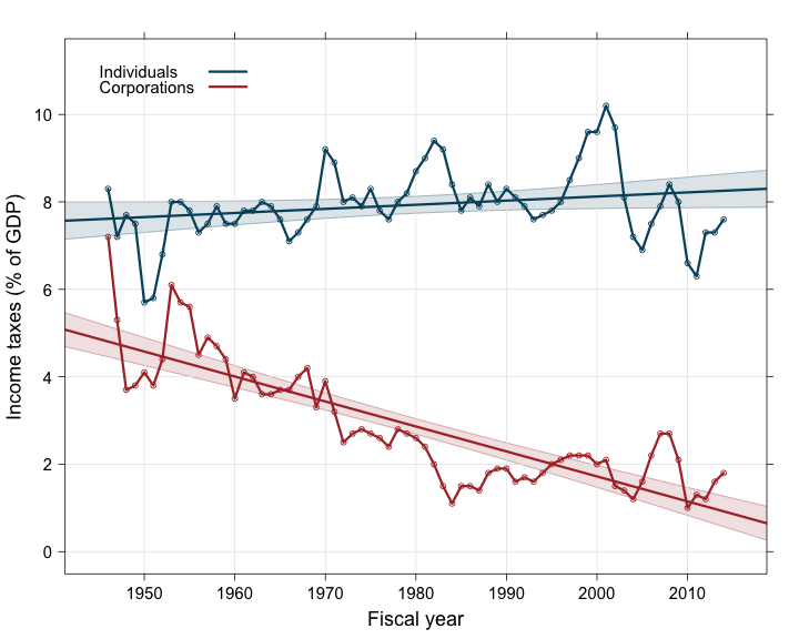
plt.plot(quandl_data["Fiscal_Year"],
         individual_fitted_values,
         color="#00526D", lw=2)

plt.fill_between(quandl_data["Fiscal_Year"],
                 individual_predict_mean_ci_low,
                 individual_predict_mean_ci_upper,
                 color="#00526D", alpha=0.2)

plt.plot(quandl_data["Fiscal_Year"],
         corporation_fitted_values,
         color="#AD3333", lw=2)

plt.fill_between(quandl_data["Fiscal_Year"],
                 corporation_predict_mean_ci_low,
                 corporation_predict_mean_ci_upper,
                 color="#AD3333", alpha=0.2)

plt.legend(loc="upper left");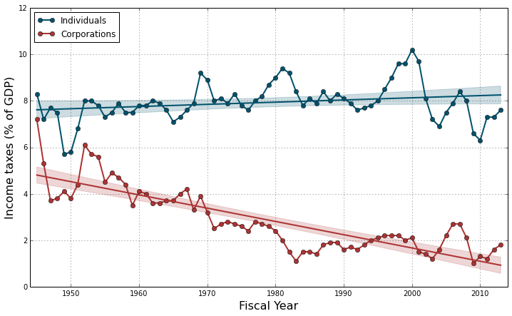
And that’s it for today! We hope that you enjoyed it and that you’ll come back next time to find out more about running diagnotic tests and correcting potential errors on today’s linear models.
3 - Source code
R and Python source codes are available here.
- Like it? Share it on:


Categories: blog • rvspython • r •